Monthly Archives: March 2015

Textbook–new chapter; addendum; scrap for the bin?

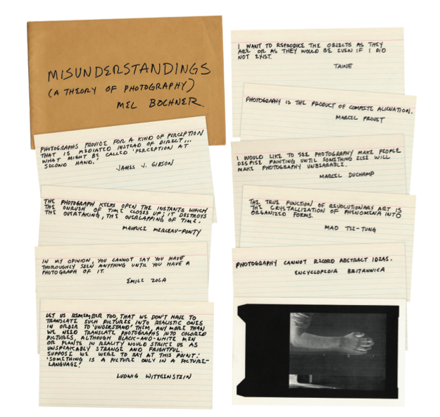
I thought I was working my way towards the end of this project.  I’ve been doing some research on ‘fire’ – in art, in photography – because I feel that will be the ‘end game’; burning the book!  But, inspired by the exhibitions in London – David Batchelor’s October and the Adventures of the Black Square (see here) – and by reading about Mel Bochner’s Misunderstandings (A Theory of Photography) 1967-70 (see here), I’ve produced two new images in the last few days.  They could take the project off on another detour, which might be a waste of time, but I’m quite pleased with them.  I can’t tell whether they ‘work’, in the sense of having the potential to be ‘read’ by a viewer in a manner that the viewer finds to be of any significance, but they do seem to be coming out of somewhere that matters to me – so I’m sharing them here and ‘reflecting’.  I’m not going to give them titles – not yet.

Untitled 1

Untitled 1

Untitled 2

Untitled 2

The aesthetic owes something to David Batchelor – shades of the colouring book and the doodle – with a hint of student’s studies (wonder why?!) and a touch of the ransom note thrown in for good measure! I’m reminded of the surrealist’s automatic writing – though it isn’t purely automatic of course.  There’s a linguistic ambiguity that seems to work alongside the visual ambiguity of the ‘constructs’ that I’ve made – hints of ‘meaning’ that never quite deliver, a search for certainty that was never there.

So I have a feeling that these have potential to add value to the project (and further delay the end game!); but they are new and raw, so not entirely sure, yet!

Advertisement

Following the ‘Black Square’ and finding a colourful resonance

rh-david-batchelor-october-hero-i-medium

David Batchelor 2012-13 ‘October Colouring-In Book’ – book cover

Last Friday, my wife and I spent a most enjoyable five or so hours at the Whitechapel Gallery, viewing a series of exhibitions that principally link into Adventures of the Black Square: Abstract Art and Society 1915-2015.  I’ll probably do a separate post on that main theme at some stage, and on Stamp Out Photographie, but the main purpose of this blog is to reflect on and refer to a body of work that was part of the main exhibition but which stands on its own and had particular resonance for me – ‘October Colouring-In Book’ 2012-13, by David Batchelor.  (I can’t link to his website page for this work because the page isn’t currently working; but that’s the cover of the book above; and there is a selection of images from the series, plus a short interview with the artist, here.)

In a wonderful piece of subversion, which appeals to me very directly, Batchelor has taken an actual copy of the first ever issue of October magazine, from 1976, and – to put it very simply – coloured it in!  Well, some of it is blacked out, to be precise, like a massive piece of censorial redaction, but it is the ‘felt-tip’ style circles, squares, triangles, lines – like some splendid doodling exercise – that really strike home.  That’s particularly true because, in its near-40 year history, October has never featured a single colour image!  There are a few words left readable here and there – including some key names such as Editor, Michel Foucault, and writer, Rosalind Krauss – but no page goes unscathed, and they are separated and framed individually for display in the exhibition.

The work appeals to my subversive and destructive nature – see this – and seems to resonate well with the Textbook Project in general.  Batchelor is appropriating something that relates to a different time, not so outmoded and distant as the photographic chemistry textbook, perhaps, but certainly ‘removed’ from now – or so it seems.  He is transforming it into a new signification that both mocks and yet pays a kind of tribute.  He wouldn’t have done it had October not been such a respected art journal; but it takes on a much lighter and jollier face in this new role as a piece of abstract art.  He is making a point about the journal’s emphasis on text over image, of course, and I like his comment in the interview that those original writers and editors would have been delighted that someone had spent three months pouring over every square inch of the publication!  As well as being enjoyable in its own right, the work provides a very useful contextual reference for my project – the appropriation, the destruction, the introduction of colour where there was none before, the subversion, it’s all there.