Category Archives: Exhibitions

Paris in the Springtime–Episode Two

Lilac in Paris April 2014 (1 of 1)

Indulgence in some ‘pretty’ photography – why not?  This is the second of three, maybe four, write-ups from my visit to Paris last week.  Here, I’m focusing on two more contemporary exhibitions – in terms of subjects, artists and presentation.

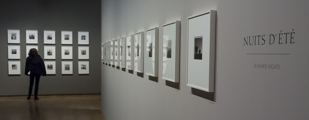
As well as the Robert Adams (blogged here), Jeu de Paume also had a sizeable exhibition of works by French photographer, Mathieu Pernot.  New to me, Pernot, the exhibition notes tell me, “… specialises in documentary work, but offers a new take on the codes of this photographic genre …”, exploring “… alternative paths …” to develop a “… multi-voiced narrative …”.  The reference to genre leads me to link his work with Part One of this module.  He uses archive, found images and elements of psychogeography, which, apart from the fact that I found the work genuinely interesting and stimulating, makes him particularly apt for this blog.  The exhibition presented works from around 10 or 11 different series that he has produced over the last twenty or so years, with a common – though not exclusive – theme of nomadic and precarious characters e.g. gypsies and migrants.  In other hands, images of such subject matter can seem separate – the ‘other’ – but I got much less of that sensation from Pernot’s work.  In some cases, I think, this was because it felt more genuinely ‘involved’ and collaborative e.g. Giovanni 1995-2012, where he has photographed the same subject, a Roma Gypsy, over an eighteen year period.  In others, oddly, it was an element of abstraction and detachment that avoided the sense of exploitation that can sometimes go with ‘other’ photography.  The series below, called Migrants, is a case in point.

Mathieu Pernot The Migrants (1 of 1)

Pernot has photographed Afghan migrants, in a Paris square where they gather, early in the morning before they are moved on by the police.  Recording them under their blankets, sleeping bags etc may, as the the exhibition notes say, reduce them “… to the condition of simple forms …” but it also seems to make it possible for me to look at them and speculate about their situation without the sense of exploitation that I can feel when the face is looking back.  I’m not sure how rational that is or whether it is something other viewers feel but I got more out of these images than the hundreds of photographs of migrants that I’ve seen in newspapers or other exhibitions of documentary work.  It might simply be that these are ‘different’ or it might be because they are more like still-life images.  Also, just the day before, I’d been at the Rodin Museum where one line of comparison between him and Robert Mapplethorpe (coming up in Episode Three) was the use of drapery.  Whilst coming nowhere near the aesthetic qualities of a Rodin sculpture or a Mapplethorpe print, there is something directly comparable about these, to which is added the dimension that these are ‘real’ (dangerous word!).  There is someone under there with a real story (one of which, by the way, was recorded on the opposite wall in The Afghan Notebooks).

Mathieu Pernot Witnesses (1 of 1)

This image is from another part of the Pernot exhibition, which brings together two of his series – The Best of All Worlds and Witnesses.  Both are based on a collection of sixty postcards, published between 1950 and 1980, showing high-rise housing estates in French suburbs, considered to be symbols of progress, at the time.  (Not unlike parts of Martin Parr’s Boring Postcards, but used in a somewhat different way).  In The Best of All Worlds, Pernot has simply reproduced and enlarged the postcards to ‘gallery-size’ prints, a process that obviously raises their profile but also emphasises the artificiality of the colours – and of the whole environment and the way it was being presented in the cards; as though the enlargement takes us through the veil.  In Witnesses, he goes a stage further, homing on on the tiny figures of people, accidentally caught up in the photograph (and the narrative, too, of course), and enlarging them even further so that they are no longer anonymous incidentals but the main subject of the image.  This process takes me right back to Arles, last summer, and the work of John Stezaker (blogged here), who created tiny exhibition images of figures cut from larger photographic prints).

I have been truly impressed by Pernot’s work and his “… multi-voiced narrative …”.  Rather in the way that I have thought about using studio-based work to respond to events, he has created ‘documentary’ work that moves beyond the (mere) taking of photographs, and is all the more powerful and effective for that.  There were other series worthy of note that I’m not covering here that do appear on the website – A Bohemian Camp, for example, which starts from an archive of images and documents from a camp for nomadic people created by the French Vichy government on 1942.  I would rate this one of the best exhibitions I have seen in a while.

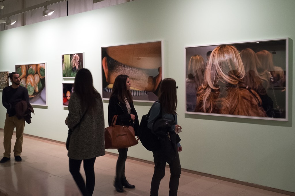
I had visit Le Bal before and this smallish gallery in Montmartre lived up to the promise of that last visit.  Quite apart from the exhibition, to which I’ll come in a moment, the space is excellent, the culture is very much contemporary photography, and the welcome & service are both excellent.  The staff at the super little cafe went out of their way to accommodate eight hungry OCA students and so ‘full marks’ for that.  This time, the exhibition was of work by two artists of whom, like Pernot, I had never heard before – Mikhael Subotzky and Patrick Waterhouse.  The former is South African and the latter British; and this was their collaboration on Ponte City.  I must admit that I had done little preparation for this particular exhibition (much of the background on Le Bal’s site being – perfectly reasonably – in French), but subsequent reading further informs me about Ponte City itself – a circular tower-block building in Johannesburg that seems to have as many stories as it has storeys (54)!  It was built during apartheid, in 1976, targeted at white middle-class couples, but has gone through various phases – sometimes seeming to epitomise the hope for a brighter South African future and sometimes seeming to represent (and house) the least positive aspects of the reality of the country’s struggles with itself, its past, and economic reality.  The exhibition seeks to explore that history – partly through new photography, some of it portrait, some documentary, some almost more typology – but also through a variety of other sources such as promotional material, architects’ drawings, found objects, old photographs, magazines, letters/communications, handwritten accounts, tear-sheets, and so on.  And it works – not especially on the level of photography itself, though that is clearly a crucial element and, to an extent, a subject of the work, but as documentary art representing social history in a varied, interesting and stimulating manner.

Subotsky & Waterhouse Le Bal (1 of 1)

This image gives a flavour of how it uses and presents the mixed media – in this case, mainly found material though there is a glimpse of a large-scale image on the right.  It also demonstrates a phenomenon that was common in this show, but also present in Pernot’s exhibition (and others on the Paris trip) – the impossibly high exhibits.  Short of taking a ladder, it is physically impossible to look at several of the images and items that are placed high on the wall.  The only conclusion is that it is meant to be viewed as a whole, as in this image, and/or that we are meant to feel a sense that however long we look we will only ever know part of the story.  Sometimes, it was intended to relate to the height of the building, as in the presentation on the far wall below.

Subotsky & Waterhouse Le Bal 2 (1 of 1)

There was no shortage of accessible material to look at, so I’m not suggesting this approach detracted from the effectiveness, but it was certainly unusual (albeit, as I say, a characteristic of more than one of the Paris shows).  As with Pernot, there is much to learn from the use of varied materials, beyond the purely photographic.  And, as fellow student Stephanie identified for us, this work has been exhibited in different ways at different locations – see here.  There was also some creative and interesting detail to reward the closer look.  Look at the combination of newly-created photograph, found image, and document in this specific exhibit.

Subotsky & Waterhouse Le Bal Detail (1 of 1)

So, two contemporary exhibitions, both operating broadly in the documentary field, which have demonstrated the effectiveness of taking a flexible and multi-faceted approach to the presentation of photographic material.  They have also introduced me to some new names to follow – especially Mathieu Pernot.

Advertisement

Paris in the Springtime–Episode One

Place-des-Vosges-1-of-1.jpgWhere to start?  One week in Paris; 6 galleries/museums; 9 exhibitions; oh, also, beautiful spring weather, good food, accompanied by the love of my life; and the chance to spend some good quality time with a great bunch of fellow students who had come to Paris from various corners of the world!  It was a special week.

My blogging will concentrate on the art, of course, and it looks as though it will come out in three ‘episodes’ – or maybe there will be a fourth.  There is no particular order to it, but I’m going to start with an interesting comparison between two very different photographers, who produced – unsurprisingly – two very different exhibitions.

I first spotted that there was to be a major touring exhibition of Robert Adams’ work a couple of years ago, when it opened in the USA; and also noted, at the time, that it was not coming to the UK.  So, it was a privilege to have the chance to view it at the Jeu de Paume last week.  Entitled The Place We Live, it encompasses more than 200 prints of his work, from the 1960s to the present day.  I have never found myself especially attracted to his work and so have never looked at the many books he has produced.  This exhibition confirmed the importance of seeing his work in series and in sequence.  It still left me feeling somewhat ‘cool’ about it – but with immense respect at the same time.

Adams-Jeu-de-Paume-1-of-1.jpg

I find Adams’ photographs very serious and intense.  He combines his obvious humanity and ‘goodness’ with a high level of tenacity, application, and commitment.  His series are highly intelligent – intellectual even – produced to a very high standard, and communicate with a notable consistency of voice.  At the same time, they tend to underwhelm me – even when brought together in the way they are in this exhibition.  The images seem, to me, caught up amongst the modernists and traditionalists – speaking with a calm and thoughtful voice that perhaps isn’t loud enough or brash enough for today’s world.  I realise that some would say ‘all the better for that’, and I can understand that point of view; but I seem to find myself looking for a bit more anger, more vibrancy, more obvious passion.  That wouldn’t be Robert Adams, I realise, since he seeks ‘balance’ and ”… a tension so exact that it is peace”.  So, I reiterate my respect for him and his work, and my privilege at seeing this collection.

In complete contrast, at the Maison Européenne de la Photographie, was Martin Parr’s Paris – which we viewed later the same day.  The gallery’s note says that it “… lui a donné carte blanche” and the result is around sixty large scale prints, in vivid colour, and pointing the Parr ‘finger’, good-heartedly, I’d say, at various aspects of Paris life.  This is new work, produced over a two year period, and also in book form (arranged as though it were some form of Paris map book, with plasticised’ cover).  The exhibition is (no surprise) brash, vibrant, highly colourful, and highly enjoyable.  The photographer’s eye for absurdity, his love of kitsch, and his sense of humour, are all in full action.  Does it have something serious to say – possibly not – though it didn’t feel unlike the Paris we’d been walking around for a few days before.  I did find the arrangement of the images – the sequencing – interesting.

Parr-Paris-Exhibition-1-of-1.jpg

On this wall, a garish image of ‘escargots’, their shells covered with smooth hair-like patterns and their insides stuffed with bright green garlic butter, are juxtaposed with a woman’s head of flowing hair and a wispy green ‘hair-like’ plant.  At first, the image of two hard-boiled eggs below seem out of place, until we see the ears of the man in the next picture – who appears to have just had his hair shaved, judging by the little pieces lying on his collar and scarf.  Then we return to the long, flowing locks, and so on …  It isn’t especially sophisticated, but it works (for me).  It occurs to me that Parr’s aesthetic is that of the advertising poster or the magazine.  That makes it familiar and easily accessible – populist, I guess.  It is certainly different from Adams’.

That’s why I found these two exhibitions such a fascinating contrast on the same day.  It’s a bit like an exam question – compare and contrast – which do you like best and why.  I’m prepared to admit that the Martin Parr had more appeal for me.  Adams, great as he is, feels as though he is speaking from a different time – all balance and reason, form and composition, restrained black and white.  Parr is today – attention-grabbing, noisy, assertive, full of colour and energy, often superficial, always on the move.  I wonder what each would make of the other’s exhibition?  As successful professionals, they would have mutual respect, of course – but something makes me feel that Parr’s respect for Adams would be greater than that returned the other way!  Who knows.


diCorcia at the Hepworth–not sure!

Di Corcia - Hepworth-4

Even with the space of a few days to reflect, I find myself unsure about my response to the Philip-Lorca diCorcia retrospective at the Hepworth Gallery, Wakefield, which I visited with fellow OCA students & tutor, Andrew Conroy, last Saturday.  It’s a big exhibition; and I also remain slightly sceptical of my own ability to take in work that I view with a large group of people – useful as study visits and contact with fellow students are, always.  I need to go back and look again.  But the uncertainty of my reaction is also, I think, about the work itself – and our group discussion also reflected the same questions, I recall.

It is a retrospective, as I say, but somewhat unusually the work is apparently presented in a sort of reverse order – starting with East of Eden, his more recent and ongoing work that follows the economic collapse of 2008 and relates to both the Old Testament ‘Eden’ and the Steinbeck novel of the same name as the series.  It then progresses with Lucky 13, his photographs of female pole-dancers (partly, apparently, reflecting the images of falling bodies at 9/11); Streetwork and Heads, both created – in different ways – on the streets of major cities; the famous Hustlers series depicting male prostitutes from Hollywood’s Santa Monica Boulevard; and ends with A Storybook Life which was published as a book in 2003 but stretches right back to 1975, and so, fundamentally, reflects his earliest work.  Everything except the final group, is presented in the form of very large prints (the most recent being inkjets), but the 76 prints for Storybook Life are on a more intimate scale, running as a series around six walls in two connected but separate spaces.  The general reaction of our group, to which I would largely subscribe, was that we found the recent work somewhat contrived and difficult to ‘enjoy’; the oldest work the most accessible and, probably, most ‘enjoyable’; and what went between impressive and thought-provoking, whilst open to question as well.

It’s never a bad thing to consider what words immediately spring to mind when reacting to works of art – the ‘gut reaction’.  I wrote down “Impersonal, detached, formal and intellectually thought-provoking” – but I would add that those words apply less to the Storybook Life series.  Let’s take the well-known Heads series, as in this composite image taken in the gallery.

Heads - Di Corcia - Hepworth

Famously, diCorcia set up strobe lighting on scaffolding, which was then triggered by passers-by, whose faces were captured in split-second isolation as they walked the streets of New York.  The accompanying curatorial text uses words such as “anonymous” and “enigmatic”.  I had seen most of these before in books but here they are printed very large and command your attention – but I’m left wondering what they actually say to me.  It is only diCorcia’s isolation of their ‘portrait’, his formalisation of their image as a beautiful print, and his decision to make them so big on a gallery wall that gives them any significance at all.  We compared their creation to the Cartier-Bresson ‘decisive moment’.  Whilst that idea itself may have become open to question, it was at least formulated on the idea that the photographer’s mind/eye combination would select the significant instance in which to press the shutter.  In this case, the photographer created the situation, but left the ‘moment’ to chance and has, as a result, created significance out of insignificance.  That isn’t such an unusual approach in photography, of course; in fact, it’s what I’m doing myself, certainly with the studio work.  But I think that’s where I end up with this work (and perhaps where diCorcia ends up, too) – it’s quite formal work about the medium of photography and its relationship with the truth and the real, just like so much contemporary work.  It certainly isn’t about these people, or even about people at all,  It’s about the combination of camera and light to create a momentary ‘something’, which might provoke questions in the mind of the discerning viewer.  It’s also diCorcia overcoming his reticence about photographing people, using a detached and impersonal approach that essentially ‘removes’ him to one side of the process.  It’s about modern photography’s ability to produce monumental gallery images that have the sort of presence formerly associated with painting.  And it’s also about the art market – naturally!

Di Corcia - Hepworth-3

(Almost all of the images in the gallery were glazed.  In order to avoid ‘starring’, I have shot these at an angle.  I pondered whether to contact diCorcia’s office for permission to use the actual images but decided to use my own.  That was partly prompted by the fact that the one below, taken from the front seat of a car, seems to work quite well at this odd angle!)

Mention of ‘market’ brings me to Hustlers, the series with a transactional dimension to it. diCorcia paid the prostitutes to have their portraits made; the fee being whatever they would normally charge for sex.  We know that, from the history of the work and from the accompanying text; and we know the amount from the captions.  So we must assume that diCorcia wants us to view these images in the full knowledge of how they were made.  That, for me, makes them much more ‘personal’ than the Heads series.  The subject knows that he is being photographed and has collaborated with diCorcia in the process and pose.  The gallery text compares the two forms of transaction, concluding that they are “… both forms of selling their bodies for another use”” …” and also suggesting that “… the men depicted become a collective symbol of broken dreams …”.  I can see both those points, of course, by I also got this sense of detachment again.  They almost all stare off into the distance, which kind of makes the ‘dreams’ context a bit obvious.  And I wondered whether the beautiful cinematic lighting and (again) high quality gallery-size print didn’t almost glorify their circumstances and pander to the dreams, to an extent.  There were two exceptions to the ‘distant stare’; and I felt that there was more in these two images – both individually and as a contrast – than in the others.  What a difference when the subject is looking right back at us.

Di Corcia - Hepworth-1 Di Corcia - Hepworth-2

Now the detachment is gone and we are engaged with and by the young men.  And what a contrast in the gaze.  For me, these two were the most effective in the Hustlers series – yet they were the least typical.

To my surprise, it was the A Storybook Life series that engaged me most.  There is a ‘flip through’ the book here.  I didn’t really get fully to grips with it in the limited time available, and I do intend to go back.  The sequencing was fascinating and needs more time – I sensed that sometimes it was based on form, sometimes colour, sometimes subject matter, and sometimes unconnected detail.  With 76 images on the walls, there was plenty of opportunity to speculate about that aspect.  Many/most of the images are ‘staged’, so we are still working with that aspect of diCorcia’s work – photography’s ability to explore/challenge truth and reality – but the smaller scale and the variety (and quantity) of images seemed to invite a more ‘human’ engagement.

And there I come back to being ‘unsure’ about my overall response.  diCorcia’s reputation would seem to rest, mostly anyway, on those big ‘block-buster’ series like Heads and Hustlers; and those series are impressive and thought-provoking.  But I find myself more interested in some lesser-known and less immediately impressive work where, rightly or wrongly, I felt there might be more of diCorcia the person/artist.  It is a very big exhibition and I really do need a second visit.  To be continued …!

Edited with this addition 20th April 2014

I have been back – last Thursday.  Reading through this post, written just after my first visit, I tend to think I got it ‘about right’.  This time I went through in chronological order – and I think that’s the right way to do it.  The ‘A Storybook Life’ series is a fascinating one – both for its content (some ‘real’ and some ‘constructed’) and for its form & sequencing.  I found myself wondering whether I was ‘forcing’ my interpretation or genuinely ‘reading’ the work.  But I think that’s the very point – di Corcia is presenting us with a stimulus and leaving us with plenty of scope to put our own interpretation on it.  ‘Heads’ seems, even more on second viewing, to raise questions about the photographic image on a gallery wall.  There is, I sense, nothing at all in the subject matter of the images; they are entirely ‘insignificant moments’.  Only the photographer’s combination of a flash of light, carefully positioned and primed equipment, selective editing, and printing to monumental size, is significant.  And the more recent work feels unfinished, which I suspect it is.  I’m glad I went twice; I broadly feel happier with the work and my reaction to it after a second viewing; and I now rate it rather higher, overall, than I did first time round.

One City; One and a Half Days; Eight Exhibitions; Two Women; and a Shortage of Colour

2004 Lycra Channel Young In-Style Awards In Shanghai

Doing eight exhibitions in a day and a half in London is madness, I admit, and not conducive to serious consideration of any of them.  But there was no stand-out show that I had wanted to see in advance – lots that were interesting but nothing that felt ‘must see’ – so I went for quantity over quality (of appreciation, not work).  Reflecting afterwards, these two women, Hannah Höch & Isabella Blow (my wife’s choice for a visit), had the strongest impact on me & I also couldn’t get the physical similarity out of my mind, either, hence the compiled image above. And the shortage of colour?  The men – Ray-Jones & Parr at Media Space; Chris Shaw & Moriyama at Tate Britain; David Lynch, William Burroughs & Andy Warhol at the Photographers’ Gallery – almost without exception (those being a handful of Burroughs’ photos) these were black and white prints – hundreds of them!

Hannah Höch at the Whitechapel Gallery (here) was excellent.  “Well, I can’t exactly see them needing to close Whitechapel High Street because of the stampedes to see this one” is the opening sentence of Alastair Smart’s Review on the Telegraph website!  So attitudes to her work haven’t improved much since 1930s Germany, it seems! (Though, to be fair, his comment is more about the attitude of others than his own.)  Actually, even though the High Street was indeed still open, there were a lot of people viewing the exhibition last Sunday – and rightly so.

It’s the first dedicated UK exhibition of her work – more than 35 years after her death and nearly a hundred years after the creation of some of the earliest works.  Reading other reviews and the exhibition information, one gets the impression that there are what one might call some ‘standard’ views of her and her work – another classic being the comment from one of her fellow Berlin Dadaists that (more or less) she was good at providing beer and sandwiches (as the only female on the team, of course).  I tried, in my rapid scan around this show, to focus on the work and, on the whole, I thoroughly enjoyed what I saw.  There was some early stuff on show; then a wide selection from the Dada-influenced period in the 20s & 30s; and then a whole room dedicated to her Post Second World War work.  It was the middle group that was strongest for me – deftly cut and assembled collages in subtle muted colours which, clothed in a velvet glove and presented with good humour, poked a forceful finger at pretty much everything around her – art in general; her fellow Dadaists; pompous politicians and business men; and, albeit with some care, the principles of the Nazis (from whom she eventually had to quietly hide away until the previously mentioned post-war period).  I got a strong sense of the subversive anarchist, which appealed, and she still managed to organise the beer and sandwiches!  Good for her!  The more abstract post-war work just seemed more formal, more distant – also more thoughtful, perhaps, but lacking some of the energy and directness of the previous work.  I’m delighted to have seen the show and may yet purchase what looked like an excellent catalogue – for further study and to help inform and inspire as I, potentially, do more collaging and montaging of my own.

Now, on to Somerset House and an exhibition which, I suppose, would not normally fall into the art category, but which made an impression in all sorts of ways – Isabella Blow: Fashion Galore.  No photography was allowed, but somehow this image found its way onto my memory card.

Isabella Blow exhibition at Somerset House

Blow was, of course, highly influential in the fashion world in the eighties, nineties and noughties, until she took her own life in 2007.  Her influence partly came through writing and editorial roles with Vogue, Tatler, Sunday Times etc, but she is probably best known as the champion of some of Britain’s most successful young designers at the start of their careers – Alexander McQueen, Philip Treacy, and Julian MacDonald being some of the best known.  Now let me emphasise, the world of fashion has only a passing interest for me, and whatever else I might be about to say about the show, it certainly emphatically re-affirmed notions of superficiality, extreme commercialism, indulgence, fierce pressure and competition, one might even go so far as to say pointlessness!  However, here was another woman with strong convictions, determined to pursue the ’causes’ she supported, and with a ruthless determination to make things happen.  Here also was an opportunity to see, up-close and in-the-flesh, just what all the fuss is about in terms of the clothes.  For example, Philip Treacy’s hats – I don’t suppose an endorsement from me is going to do much to further boost his reputation (!), but to see them in reality is to understand why so many women want wear them.  Genius – a kind of irreverent attitude to the whole spatial and formal notion of what a hat might be!

Also worth a mention is the presentation of the exhibition itself – the use of the space; the steady build up from informative words and pictures on an intimate scale; through the placing of McQueen designs on museum-like pedestals; to the spectacle of the room above; industrial-style plastic hanging dividers and specially constructed staircase; then an insane large-screen presentation of one of McQueen’s Paris shows; then a soft, slow exit to Bryan Ferry’s voice!  It works well – but it also left that feeling of insane pointlessness and waste!  She took her own life; Alexander McQueen took his own life; the huge global commercial fashion circus rolls on, drawing in, chewing up and swallowing, sometimes spitting out, endless talent and creativity.

Then’ it’s just going to be, for now certainly, a passing mention for some other shows seen this week:

‘Making it Up: Photographic Fictions’ at the V&A

Making it Up V&A

It was good to see originals from the likes of Hannah Starkey & Gregory Crewdson; but this type of mixed show, many artists all presented together in a single, relatively small room, doesn’t really inform or inspire.

Media Space (Science Museum) – Tony Ray-Jones & Martin Parr 

A very big show, which we ‘consumed’ rather quickly, late Sunday afternoon, but I’m glad to have seen it.  It’s in, broadly, three parts – Ray-Jones originals; Parr’s Hebden Bridge images, which were directly influenced by and closely followed the Ray-Jones work; then Parr’s selections from other Ray-Jones contact sheets (also on show), digitally printed for this show.  A lot of the work is familiar, from books or previous shows I’ve seen, but it’s a very comprehensive and informative (and amusing) exhibition – all in black and white!  The contact sheets would have been worthy of more detailed study.  It looked, from a quick scan, as though Ray-Jones typically shot four or five images of a particular scene, and that one or two selections from each roll of film was about the norm.

Tate Britain – Chris Shaw (and Daido Moriyama)

We hadn’t planned to see this, but stumbled upon it in the Tate.  The link is here.  It covers three (black and white!) series from British photographer, Chris Shaw, with whom I was not familiar before.  They are displayed alongside 3 or 4 Moriyama’s (black & white – naturally) – he having been a major influence on Shaw’s work.  I enjoyed Shaw’s  ”Weeds of Wallasey” – shot in the post-industrial wastelands of the Wirral, where he grew up.  Look out for ‘The haywain by constable‘!

Photographers Gallery – Three Shows – Lynch, Burroughs & Warhol

Three (black & white!) shows were on at the Photographers’ Gallery – all by ‘non-photographers’,so to speak – David Lynch; William Burroughs; and Andy Warhol.  It was free entry day on Monday and the place was heaving mid-afternoon; and I was suffering exhibition (black & white!) fatigue by this stage.  However, I did take one gem of a notion away from these shows.  Andy Warhol liked to stitch images together.  We’re all familiar with his multi-exposure, colour screen print portraits, or bean cans, or whatever – but here we had photographic prints of, for example, Jerry Hall reclining on a sofa with a glass of champagne, nine of them all developed slightly differently, actually stitched together, with white thread, on a sewing machine by the look of it.  That’s one to think about in doing collage work!

As I said at the start of this post, eight shows in one and a half days doesn’t really work.  However, I’m particularly glad to have seen the Höch show and to have experienced something different with Isabella at Somerset House; now for a lie down.

Genres – Responding to the archive

Lion Tamer - Tyne & Wear Archives & Museums

Lion Tamer – Tyne & Wear Museums & Archive – via Flickr Creative Commons

I was looking for something to illustrate my reflections about ‘the archive’ and specifically searched for a photo of an archive.  Nothing came up, but this photograph leapt off the screen at me.  It was, originally, a glass slide, one of a number of fairground images in that format found in a store at the Discovery Museum, Tyne & Wear.  There is absolutely no information about the photographer, the subject, the location, the purpose – nothing.  It is so tempting to begin to speculate, to interpret.  But what right do I have, probably one hundred years after it was taken?  Leave him and his lions (well two of them at least) to stare out at us over the decades; and let whatever is happening off frame, to their right, remain a historical mystery.  This is just one of the billions of images I can access, almost instantly, via the 21st century ‘archive’ that is the internet.  Is there any wonder that so many contemporary artists use that creative potential to seek to create meaning?

Coincidentally, the Tyne & Wear Archive was one of several sources of photographs, prints, paintings, artefacts, recordings and other parephenalia, used by Jeremy Deller in putting together ‘All That is Solid Melts into Air’, which is currently on show at Manchester Art Gallery, and which I saw last week.  To be a little more precise, he sourced from 9 museums; 2 libraries; 2 city archives; 4 art galleries; plus various artists & private collections, as well as creating some of the work himself.  Deller’s working method is very curatorial; and I suppose there might be debate as to whether this was ‘his work’ or just an exhibition that he has curated.  I would go with the former – but I’m not sure it matters.  What he does, with this work, is invite the 21st century viewer to consider and relate to his/her history – specifically to the impact of the Industrial Revolution on British people and culture – by a careful and clever juxtaposition of images, artefacts, sounds and creations, from the very recent past to the late eighteenth century.  It is fair to say that, in the context of this note and this section of my Body of Work module, he is working with and responding to ‘the archive’.

The module notes invite me to look at an article written, in 1986, by Allan Sekula, titled ‘Reading an archive: photography between labour and capital’, which appears in ‘Visual Culture: a reader’, edited by Evans and Hall, Sage Publications, London, 1999.  The article links the photographic archive with power, in the context of economic life (pertinent, therefore, to the Deller exhibition).  In essence, the argument goes along these lines:

  • The archive is ‘property’ and subbordinates original meaning and use to the logic of exchange.
  • Meaning depends on context and the archive, by supplying institutional authority and control, shifts images away from their origins and so may release the user (of the archive) from the responsibility to refer to original meaning and purpose.
  • This maintains a hidden connection between knowledge and power.
  • He also questions the validity of photographs as historical documents (or at least he questions history that is based on photographs) and as artworks.  The former tends towards spectacle and exoticism and the latter towards romanticism (if it favours the authorial perspective) or detachment, irony and even contempt (if it treats the photograph as a found object to be ‘interpreted’ – my ‘Lion Tamer’, for example).

Photography, Sekula concludes, has served as a tool of industrial and bureaucratic power.

Reflecting on this, I note:

  • that it was written nearly 30 years ago, in the context of physical, and largely institutional archiving, as opposed to open and digital archives;
  • that the scale of what might be interpreted as the photographic archive has moved on, as have the means of organising and the scope for searching and selecting images;
  • but the ‘power’ issue is potentially even more important – in the context of online archives, stock photography, sophisticated search engines, and the explosion of web-based vernacular images;
  • plus, the subordination of original use and the scope for new meaning becomes even more significant when ‘ownership’ is a) disputed anyway, with so many ‘orphan images’ circulating the web, and b) even further separated from the originator and any notion of authorial authority.

In ‘The Photographic Image in Digital Culture’, edited by Martin Lister, Routledge London, 2013, Nina Lager Vestberg’s article ‘The Photographic Image in Digital Archives’  confirms that 1980s critical studies of the archive, such as Sekula’s, were concerned with the ‘uses and abuses’ of the archive and approached the idea from a materialistic perspective.  Looking with a more contemporary perspective, she distinguishes between ‘Digitisation’ of images, including those from the old, physical archives, and ‘Computerisation’ of working practics – the latter leading to a changing role for the archivist (interfacing between user and ‘system’ as opposed to user and ‘image) and the ‘invisibility’ of the algorithmic search.  In the context of ‘stock photography’, she also notes the huge increase in staged or modelled images designed purely for stock purposes (Paul Frosh, in the same publication, refers to the ‘wallpaper of consumer culture’); the use of keywords (often highly conceptual in nature) to fuel searches and retrieval of images; and the changes to licencing rights.

Which brings me, directed by the module notes and in the context of keywords, to Taryn Simon’s ‘The Picture Collection’, an exhibition based on selections from the New York Library’s picture archive.  That archive comprises 12,000 folders, with individual titles such as ‘Handshaking, ‘Express Highways’ and ‘Yellow’, to name just three, which contain, in total, 1.2 million physical images, collected together by the library staff, since 1915.  Simon makes her own selection, from a selection of the folders, to create large scale ‘collage-type’ images.  Even without seeing the physical exhibition itself, one is prompted to reflect on the very process of the archive’s compilation over nearly 100 years, and the short video in this link highlights the fascinating juxtaposition of images the archive has produced.  But I am also prompted to relate this work to the concept of ‘Keywords’ in contemporary digital archiving.  The NY Library staff, over the years, have made individual decisions to place each specific, physical image into a specifically named physical folder.  Vestberg quotes just one, relatively insignificant image that she uses to illustrate her article as having well over 100 keywords attached to it – the equivalent of placing it in over 100 of the NY Library folders at the same time, of course.

For me, this is another illustration of the challenge, in critical photographic studies, to keep up with and ‘contain’ (in a critical theoretical sense) the changes brought about by the internet and digital media.  Issues of power, control, politics, economics, meaning and truth, all of which might reasonably be discussed in the context of a photographic archive, become even harder to fully comprehend.  So, one senses, critical theory and study can become more a question of ‘coping’ than of explaining and understanding.  Frosh, in his article in the Lister book above, refers to Getty Images as having an aspiration to become a ‘total archive’.  (He compares Getty to Hobbes’ Leviathan.)  Where, one wonders, does that take Sekula’s questions about ‘power’?

One brief reflection on the ‘Lion Tamer’ – what would he make of these questions?  I allow myself that reflection only to emphasise to myself that I probably have about as much chance of knowing what his life is all about as he has of comprehending mine.  The archive, especially the great archive we call the internet, is a powerful, attractive and tempting source of creative imagery and meaning – but one to be read and interpreted with some caution.